
CSS Grid, the not-so-secret weapon of web designers and developers, has been revolutionizing the way we create layouts for websites. It’s like having a versatile, pixel-perfect puzzle in your hands, allowing you to effortlessly craft stunning web designs. In this article, we’ll embark on a journey to understand the ins and outs of CSS Grid, from the basics to advanced techniques, all while keeping things friendly and easy to grasp.
Table of Contents
Introduction to CSS Grid
What is CSS Grid?
Imagine a virtual grid system that divides your web page into rows and columns, offering you the power to precisely position and arrange elements. That’s CSS Grid in a nutshell. Unlike its predecessors, such as floats and positioning, CSS Grid was built from the ground up for layout control. It’s a game-changer, providing a more intuitive and efficient way to design web layouts.
How does it differ from other layout methods?
CSS Grid stands out for its simplicity and flexibility. While other methods like Flexbox are fantastic for one-dimensional layouts, CSS Grid takes it up a notch by handling two dimensions effortlessly. It allows you to create complex, multi-column, and multi-row layouts with ease. Plus, it doesn’t rely on HTML structure, giving you more design freedom.
Getting Started with CSS Grid
Setting up a Basic Grid
Let’s embark on your journey into the enchanting world of CSS Grid by rolling up our sleeves and starting with the basics. Creating a CSS Grid layout is like setting up the framework for your design masterpiece. Here’s how you get started:
- Container Element: To begin, select the HTML element that will serve as your grid container. This element can be a
<div>, a section, or any other suitable container. - Apply
display: grid;: Transform your chosen container into a grid by applying the CSS propertydisplay: grid;. This declaration tells the browser that this element will be the container for your grid layout. - Define Rows and Columns: Next, specify the structure of your grid by defining rows and columns. Use properties like
grid-template-rowsandgrid-template-columnsto set the dimensions. You can use various units, including pixels, percentages, or thefrunit, which represents a fraction of the available space.
Here’s a simple example:
.container {
  display: grid;
  grid-template-rows: 1fr 1fr;
  grid-template-columns: 1fr 2fr;
}
In this example, we’ve created a grid with two rows and two columns, where the first row and first column each take up one fraction of the available space, and the second column takes up two fractions.
Grid Lines and Grid Areas
In the world of CSS Grid, you’ll frequently encounter the concepts of grid lines and grid areas. These fundamental concepts are essential for achieving precise control over your layout:
- Grid Lines: Grid lines are the horizontal and vertical lines that divide your grid into sections. They act as guides for placing and aligning grid items. You can refer to them using line numbers or names.
- Grid Areas: Grid areas are the spaces enclosed by grid lines. They represent the regions where you can place content or grid items. By assigning grid items to specific areas, you can create well-structured layouts.
Understanding how to manipulate grid lines and areas empowers you to craft intricate and visually pleasing designs with CSS Grid. Think of grid lines as the blueprints and grid areas as the rooms within your layout, each serving a unique purpose.
The Power of CSS Grid
Flexible Layouts
One of the most enchanting aspects of CSS Grid is its innate flexibility. It liberates designers from the constraints of fixed-width designs that break on smaller screens. With CSS Grid, your layouts can gracefully adapt to different screen sizes and devices.
Imagine your design as a living entity that can resize and rearrange its elements seamlessly. Whether it’s a smartphone, tablet, or desktop monitor, CSS Grid ensures that your design elements respond harmoniously to the available space.
Alignment and Spacing
CSS Grid empowers you with remarkable control over the alignment and spacing of elements within your layout. Here’s how you can achieve precision:
- Alignment: You have the power to determine how items align within their grid cells. Whether you want elements to be centered, aligned to the start or end of a cell, or distributed evenly, CSS Grid provides the tools to achieve your desired alignment.
- Spacing: CSS Grid allows you to control the spacing between rows and columns. You can specify the gaps or margins to create the perfect balance between elements, ensuring your design breathes and flows beautifully.
The ability to effortlessly control alignment and spacing is a game-changer, enabling you to craft layouts that are not only visually appealing but also well-structured and user-friendly. CSS Grid puts the precision in your design toolkit.
Creating Complex Layouts
Nesting Grids
In the realm of CSS Grid, creativity knows no bounds. You’re not limited to a single grid; you can nest grids within grids. This feature opens up a world of possibilities for creating intricate and multi-layered layouts.
Picture it as a set of Russian nesting dolls for web design. Each grid serves as a container for another layer of content. This nesting capability empowers you to craft complex designs with ease, arranging content within content for maximum impact.
Imagine a dashboard with multiple widgets, each organized within its grid. Nesting grids allows you to structure these widgets precisely, creating a harmonious and visually appealing user interface.
Auto-fit and Auto-fill
Efficiency alert! CSS Grid introduces two remarkable properties: auto-fit and auto-fill. These properties automatically adjust the number of columns to fill the available space. This dynamic behavior is a game-changer for responsive designs, preventing awkward gaps or content overflow.
Here’s how they work:
- Auto-fit: With
auto-fit, the grid will automatically create as many columns as possible to fill the available space without overflowing or creating unnecessary gaps. It flexibly adapts to screen sizes, making your layout responsive. - Auto-fill: Similarly,
auto-fillcreates as many columns as possible, but it also allows empty columns if there’s excess space. This can be useful for distributing elements evenly, even when there’s extra room.
These properties simplify the complexity of designing responsive layouts. You no longer need to calculate specific column counts for different screen sizes manually. CSS Grid takes care of it for you, ensuring your design remains fluid and visually appealing.
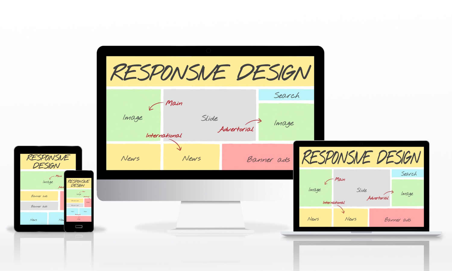
Responsive Design with CSS Grid
Media Queries and Breakpoints
Creating responsive designs is a breeze with CSS Grid, thanks to the seamless integration of media queries and breakpoints. By harnessing these tools, you can adapt your layout and grid settings based on the device’s screen size.
Here’s how it works:
- Media Queries: Media queries are CSS rules that apply styles based on device characteristics, such as screen width. You can define breakpoints in your CSS, specifying different styles for various screen sizes.
- Grid Adjustments: Within your media queries, you can adjust grid properties like the number of columns, row heights, or item placements. This allows you to optimize the layout for each screen size.
By using media queries strategically, you ensure that your website looks stunning and functions flawlessly on everything from smartphones and tablets to large desktop monitors. CSS Grid’s responsiveness is your secret weapon for delivering a consistent user experience.
Fluid Grids
Say farewell to the era of rigid, fixed-width grids. CSS Grid introduces the concept of fluid grids, where your layout gracefully expands or contracts to fit the available screen space. This fluidity ensures your design flows like water, adapting seamlessly to different screen sizes.
The magic of fluid grids lies in their ability to respond dynamically, eliminating the need for complex calculations or reliance on frameworks. Your design elements ebb and flow, maintaining their visual harmony no matter the screen dimensions.
With fluid grids, your website becomes a living, breathing entity that responds intuitively to user interactions and screen changes. It’s the epitome of user-centric design, providing a delightful experience across the digital landscape.
Browser Compatibility
Which browsers support CSS Grid?
CSS Grid enjoys robust support in modern web browsers, but it’s crucial to understand which versions offer full compatibility. When implementing CSS Grid in your web projects, it’s essential to be mindful of your target audience and their preferred browsers. Here’s a closer look at browser support:
- Modern Browsers: As of the knowledge cutoff date in September 2021, CSS Grid is well-supported in modern browsers like Google Chrome, Mozilla Firefox, Safari, Microsoft Edge, and Opera. These browsers offer comprehensive support for the CSS Grid specification, making it a reliable choice for contemporary web design.
- Internet Explorer: Internet Explorer (IE) is known for its limited support of modern web technologies. Versions of IE prior to IE 11 lack substantial CSS Grid support. However, IE 11 introduced partial support, which means basic grid layouts can be achieved, but advanced features may not work as expected.
- Edge Legacy: The older version of Microsoft Edge, known as Edge Legacy, also provides partial support for CSS Grid. Like IE 11, it can handle basic grid layouts but may encounter issues with more complex features.
- EdgeHTML (Old Edge Engine): Before transitioning to the Chromium-based Edge browser, Microsoft Edge used the EdgeHTML engine. EdgeHTML had better CSS Grid support than IE but was still somewhat limited compared to modern browsers.
Fallbacks and Polyfills
Don’t fret if your project requires support for older browsers like Internet Explorer or versions of Edge with limited CSS Grid compatibility. Here are strategies to ensure graceful degradation and support for a broader user base:
- Progressive Enhancement: Start by designing your layout using CSS Grid to take full advantage of its capabilities. This approach ensures an optimal experience for users with modern browsers that support CSS Grid.
- Conditional CSS: Use conditional CSS statements, such as media queries, to provide different styles or layouts for browsers that lack CSS Grid support. This allows you to create fallback layouts specifically tailored to older browsers.
- Grid Systems: Implement CSS Grid as the primary layout method but also include a secondary layout system, such as a float-based or flexbox-based grid, for browsers that don’t support CSS Grid. This approach maintains consistency in design while accommodating older browsers.
- Polyfills: Consider using polyfills like “Grid Polyfill” or “CSS Grid Layout Polyfill” to simulate CSS Grid behavior in unsupported browsers. These JavaScript-based solutions can help bridge the compatibility gap, although they may not provide the same level of performance and native support.
By adopting these strategies, you can ensure that your web layouts gracefully adapt to the capabilities of different browsers, ensuring a smooth user experience for a wide range of users.
Real-World Examples
Showcase of Websites Using CSS Grid
To gain a deeper appreciation for the versatility and impact of CSS Grid, let’s explore real-world websites that have harnessed its capabilities to create stunning and responsive layouts. These websites exemplify the potential of CSS Grid in various design contexts:
- Masonry-Style Portfolios: Websites showcasing portfolios of photographers, artists, and designers often use CSS Grid to create visually engaging masonry-style grids. These grids seamlessly arrange images of different sizes, creating an aesthetically pleasing and dynamic presentation.
- E-commerce Product Listings: E-commerce platforms leverage CSS Grid to arrange product listings efficiently. Grids enable easy alignment of product images, descriptions, and pricing, enhancing the user’s shopping experience.
- Magazine-Style Layouts: Online magazines and news websites utilize CSS Grid to craft intricate and responsive layouts. Grids allow for the seamless arrangement of articles, images, and advertisements, maintaining readability across various devices.
- Portfolio Websites: Many personal portfolio websites belonging to web designers and developers employ CSS Grid for showcasing projects. The flexibility of CSS Grid enables designers to experiment with unique and engaging layouts that reflect their creativity.
Before-and-After Examples
To truly grasp the transformative power of CSS Grid, let’s delve into before-and-after scenarios. These examples illustrate how CSS Grid can elevate a standard, linear layout into something extraordinary:
- Basic Blog Layout to Magazine-Style: Imagine a simple blog with a list of articles. Before implementing CSS Grid, this blog may have had a plain, linear layout. After introducing CSS Grid, the same blog can transform into a visually appealing magazine-style layout. Articles can be arranged in a grid, making better use of screen real estate and engaging readers with eye-catching visuals.
- E-commerce Product Grid: In an e-commerce setting, product listings may have previously followed a standard list format. With CSS Grid, the product grid can be optimized for visual appeal and usability. Products can be arranged in rows and columns, allowing users to easily browse and compare items.
- Portfolio Showcase: A portfolio website might have displayed projects in a simple list format. By incorporating CSS Grid, the portfolio can be elevated to a visually striking showcase. Projects can be arranged in a grid, with each project getting its dedicated space for images, descriptions, and details.
These before-and-after examples illustrate how CSS Grid empowers designers and developers to reimagine layouts, enhancing both aesthetics and user experience. It’s a tool that turns ordinary into extraordinary with ease.
Best Practices
Naming Conventions
When working with CSS Grid, maintaining consistency in your code is essential for readability and maintainability. Adopting clear naming conventions for your grid items can make your codebase more organized and easier to manage. Here are some best practices for naming conventions in CSS Grid:
- Semantic Naming: Assign meaningful and descriptive class or ID names to your grid items. For example, if you have a grid item containing product images, name it something like
.product-imageinstead of using generic names like.item1or.grid-item. - BEM (Block, Element, Modifier): Consider using the BEM methodology, which encourages a structured approach to naming CSS classes. This methodology divides class names into blocks (e.g.,
.grid), elements (e.g.,.grid__item), and modifiers (e.g.,.grid__item--highlighted). This clear hierarchy makes it easy to understand the purpose of each class. - Avoid Abbreviations: While concise class names are encouraged, avoid excessive abbreviations that might make your code cryptic. A class like
.prod-descmight be unclear, so use something more descriptive like.product-description. - Use Hyphens or Underscores: Choose a consistent separator for class names, either hyphens (e.g.,
.grid-item) or underscores (e.g.,.grid_item). Stick with your chosen separator throughout your project. - Comments: Include comments in your CSS code to explain the purpose of specific grid items or layout sections. This documentation can be invaluable for you and other team members when reviewing or modifying the code later.
By adhering to these naming conventions, you’ll create a more organized and maintainable CSS Grid layout, making it easier to understand and update in the future.
Accessibility Considerations
Ensuring web accessibility is a fundamental responsibility when designing and developing websites. CSS Grid layouts can be made accessible to all users, including those who rely on assistive technologies such as screen readers. Here are some accessibility best practices for CSS Grid:
- Use Semantic HTML: Start with well-structured, semantic HTML. Properly use HTML elements like
<header>,<nav>,<main>, and<footer>to provide a clear document structure. This helps assistive technologies understand the content and its hierarchy. - Semantic Grids: When using CSS Grid, ensure that the order of items in the HTML source reflects the logical reading order. Screen readers follow this order when conveying information to users. Use the
orderproperty to reposition grid items visually without affecting their source order. - Keyboard Navigation: Verify that your CSS Grid layout is keyboard navigable. Users should be able to navigate through grid items using the “Tab” key. Use
:focusstyles to indicate which item has keyboard focus. - ARIA Attributes: Implement Accessible Rich Internet Applications (ARIA) attributes where necessary. For instance, use
aria-labeloraria-labelledbyto provide meaningful labels for grid items or sections. Ensure that interactive elements within the grid, such as buttons or links, have appropriate ARIA roles and attributes. - Testing: Regularly test your CSS Grid layouts with screen readers to identify any accessibility issues. Popular screen reader software includes JAWS, NVDA, and VoiceOver. Make adjustments based on user feedback and testing results.
- Documentation: Include accessibility documentation in your project to guide developers and content creators in maintaining accessibility standards. This documentation should cover ARIA attributes, keyboard navigation, and other accessibility considerations specific to your grid layout.
By prioritizing accessibility in your CSS Grid designs, you contribute to a more inclusive web where all users can access and interact with your content.
Debugging CSS Grid
Common Issues and How to Fix Them
Even seasoned web developers encounter challenges when working with CSS Grid layouts. Identifying and resolving common issues is a crucial part of the development process. Here are some frequent CSS Grid issues and how to address them:
- Misalignment: Grid items not aligning as expected can be frustrating. Check your
grid-template-columnsandgrid-template-rowsdeclarations to ensure they add up to the desired dimensions. Use thejustify-items,align-items,justify-content, andalign-contentproperties to fine-tune alignment. - Overlapping Items: When grid items overlap unexpectedly, review their positioning. Ensure that you’re not inadvertently causing overlaps by using properties like
grid-columnorgrid-row. Adjust thez-indexproperty to control stacking order if necessary. - Uneven Column or Row Heights: Inconsistent column or row heights can disrupt your layout. Verify that your grid items’ content and sizing properties are correctly set. Use
grid-auto-rowsandgrid-auto-columnsto manage the size of implicit grid tracks. - Empty Cells: If cells in your grid layout appear empty, double-check that you’ve placed content within those grid items. Empty items might collapse or not render as expected.
- Responsive Challenges: Responsive design with CSS Grid can be tricky. Implement media queries to adapt your grid layout to different screen sizes and orientations. Use
auto-fitandauto-fillfor fluid grid behavior. - Browser-Specific Issues: Some browsers may interpret CSS Grid properties slightly differently. Test your layout across multiple browsers and consider using browser-specific prefixes or workarounds when needed.
Using Developer Tools
Proficiently using developer tools is an invaluable skill when debugging CSS Grid layouts. Most modern browsers offer robust developer tools that simplify the debugging process. Here’s how to leverage these tools:
- Inspect Element: Right-click on an element in your grid layout and select “Inspect” to open the developer tools. This allows you to examine the computed styles, box model, and grid properties of the selected element.
- Grid Inspector: Many developer tools include a dedicated Grid Inspector, which provides a visual representation of your grid layout. You can toggle grid overlays, view grid line numbers, and inspect individual grid items.
- Console Messages: Check the browser’s console for any error messages or warnings related to your CSS Grid layout. These messages can offer valuable clues about issues in your code.
- Live Editing: Modify CSS properties directly within the developer tools to see real-time changes on your web page. This “live editing” feature allows you to experiment with adjustments before applying them to your code.
- Responsive Design Mode: Use the responsive design mode available in some developer tools to preview your grid layout across various screen sizes and orientations. This helps ensure your design remains responsive and functional.
By becoming proficient with developer tools and regularly using them to inspect and debug your CSS Grid layouts, you’ll streamline your development process and resolve issues more efficiently.
CSS Grid vs. Flexbox
When to Use CSS Grid vs. Flexbox
Both CSS Grid and Flexbox are powerful layout tools, but they excel in different scenarios. Understanding when to use each is essential for effective web design. Here’s a guide on when to choose CSS Grid over Flexbox:
- Use CSS Grid for Two-Dimensional Layouts: CSS Grid is the go-to choice when you need to create complex, two-dimensional layouts, such as grids with rows and columns. It’s perfect for creating entire page layouts, including headers, footers, and content areas.
- Flexbox for One-Dimensional Layouts: Flexbox is best suited for one-dimensional layouts, like arranging items in a single row or column. It’s excellent for components within a page, such as navigation menus, lists, or card layouts.
- Combine Both for Comprehensive Control: In some cases, combining CSS Grid and Flexbox can provide the ultimate layout control. Use CSS Grid for larger layout structures and Flexbox for smaller, item-level arrangements within those structures. This hybrid approach combines the strengths of both techniques.
- Consider Content Flow: Think about the natural flow of content. If your design primarily follows a grid structure with consistent rows and columns, CSS Grid is likely the better choice. However, if your layout adapts to varying content sizes and flows, Flexbox may be more appropriate.
- Responsive Considerations: When building responsive designs, CSS Grid’s media queries and auto-placement capabilities make it an excellent choice. Flexbox is more suited for controlling the alignment and distribution of items within a flexible container.
- Browser Compatibility: Keep in mind browser support. CSS Grid has better support in modern browsers, while Flexbox is well-supported even in older browsers. If supporting older browsers is a priority, Flexbox may be the safer choice.
Combining Both for Powerful Layouts
Why limit yourself to just one layout method when you can leverage the strengths of both CSS Grid and Flexbox? Combining these techniques allows you to achieve comprehensive layout control. Here’s how to harness their collective power:
- Use CSS Grid for Overall Structure: Start by defining the overall structure of your layout with CSS Grid. Create rows and columns to establish the grid framework for your design.
- Apply Flexbox for Item-Level Control: Within the CSS Grid cells, use Flexbox to control the alignment and distribution of individual items. Flexbox excels at handling one-dimensional layouts within the confines of a grid cell.
- Responsive Design: CSS Grid’s built-in responsiveness capabilities make it ideal for adapting your layout to different screen sizes. Flexbox can be used to fine-tune item alignment and order within these responsive grid cells.
- Complex Components: For complex components like navigation menus or card layouts within a larger grid, Flexbox can simplify the arrangement of items. It allows you to easily center items, control spacing, and maintain consistency.
By combining CSS Grid and Flexbox judiciously, you can craft layouts that are both visually striking and functionally effective. It’s a dynamic duo that offers unparalleled control over your web designs.
CSS Grid Frameworks and Libraries
Popular Frameworks and Libraries
Harnessing the power of CSS Grid is easier with the assistance of frameworks and libraries specifically designed for grid-based layouts. Here are some popular CSS Grid frameworks and libraries to consider:
- Bootstrap: The widely-used Bootstrap framework includes a responsive grid system that utilizes Flexbox under the hood. It offers a comprehensive set of components and utilities for building modern websites quickly.
- Foundation: Foundation provides a responsive grid system built on Flexbox, making it easy to create flexible layouts. It also offers a range of UI components and JavaScript plugins for enhanced functionality.
- Grid Layout Framework: This lightweight framework focuses on creating grid-based layouts with CSS Grid. It offers predefined classes for grid container and item placement, simplifying grid creation.
- Susy: Susy is a powerful grid layout toolkit for Sass, a CSS preprocessor. It allows you to define custom grid systems and provides fine-grained control over grid generation.
- CSS Grid Generator: Online tools like the CSS Grid Generator offer a visual interface for creating CSS Grid layouts. You can customize the number of rows and columns, gap sizes, and item placements and then export the generated code.
Pros and Cons of Using Them
While CSS Grid frameworks and libraries can accelerate your development process, it’s essential to weigh their advantages and disadvantages:
Pros:
- Rapid Development: Frameworks and libraries provide pre-built grid systems and components, reducing the time required to create layouts and design elements.
- Consistency: They enforce consistency in design and layout across different parts of your website, ensuring a cohesive look and feel.
- Responsive Support: Many frameworks and libraries are designed with responsiveness in mind, making it easier to create mobile-friendly designs.
- Community and Documentation: Popular frameworks have extensive documentation and active communities, making it easier to find support and resources.
Cons:
- Learning Curve: Depending on the framework, there may be a learning curve associated with understanding its conventions and usage.
- Customization Limitations: Frameworks may impose design constraints that limit your creative freedom. Customizing layouts beyond the framework’s capabilities can be challenging.
- Performance Overhead: Including an extensive framework in your project can result in performance overhead, especially if you only need a fraction of its features.
- Dependency: Using a framework or library introduces a dependency into your project, which may need to be managed and updated regularly.
Before incorporating a CSS Grid framework or library into your project, carefully evaluate your project’s requirements and your familiarity with the tool. In some cases, building a custom grid solution may be more appropriate, offering greater control and flexibility.
Future Trends in CSS Grid
Subgrid and Other Upcoming Features
CSS Grid is an evolving technology, and exciting features are on the horizon. One of the most anticipated features is “subgrid.” Here’s a glimpse of what’s in store:
- Subgrid: Subgrid is a groundbreaking feature that allows the alignment of child elements in nested grids with the parent grid’s tracks. This enables even more complex and flexible grid layouts, where child grid items align seamlessly with the parent grid’s structure.
- Grid Gap Units: Future updates may introduce new units for grid gaps, such as “fr” (fractional units), making it easier to control spacing and layout proportions.
- Container Queries: CSS Grid may incorporate container queries, allowing grid items to adapt their size and layout based on the size of their containing element. This would enhance responsive design possibilities.
- Dynamic Grids: CSS Grid may gain the ability to adjust grid sizes and tracks dynamically based on content, reducing the need for manual adjustments.
- Improved Browser Support: As CSS Grid adoption continues to grow, browser support for advanced features is likely to become more consistent, reducing the need for workarounds and polyfills.
These upcoming features hold the promise of expanding the capabilities of CSS Grid and making it an even more powerful tool for web designers and developers.
Staying Up-to-Date
To stay current with the latest developments in CSS Grid and web design in general, consider the following tips:
- Follow Web Standards: Stay informed about web standards and specifications by regularly visiting resources like the World Wide Web Consortium (W3C) website. Monitor updates and drafts related to CSS Grid and other web technologies.
- Online Communities: Join online communities and forums for web designers and developers. Engaging in discussions and sharing knowledge with peers can provide valuable insights into emerging trends and best practices.
- Tutorials and Blogs: Follow web design and development blogs, podcasts, and video channels that cover CSS Grid and related topics. Many industry experts share tutorials and insights on these platforms.
- Online Courses: Enroll in online courses and tutorials offered by educational platforms like Coursera, Udemy, and Codecademy. These courses often provide up-to-date content on CSS Grid and web development.
- Experiment and Practice: Stay hands-on by experimenting with CSS Grid and building practical projects. The more you practice, the more you’ll adapt to new features and techniques as they emerge.
- Conferences and Workshops: Attend web development conferences, workshops, and meetups to network with professionals and gain firsthand exposure to the latest trends and technologies.
Keeping up-to-date with CSS Grid developments ensures that you can leverage its full potential in your web design projects and continue delivering cutting-edge user experiences.
Tips for Learning CSS Grid
Online Resources and Courses
Ready to dive into the world of CSS Grid? Here are some excellent online resources and courses to help you master this incredible layout tool:
- MDN Web Docs: Mozilla Developer Network’s CSS Grid guide is an authoritative resource that covers CSS Grid concepts, properties, and examples in detail.
- CSS Grid Layout by Jen Simmons: Jen Simmons, a renowned web designer and advocate for CSS Grid, offers video tutorials and articles on CSS Grid via her website and YouTube channel.
- Grid by Example: Rachel Andrew’s website provides a wealth of CSS Grid resources, including video tutorials, articles, and downloadable example layouts.
- freeCodeCamp: The freeCodeCamp platform offers a comprehensive CSS Grid course that covers the fundamentals and advanced techniques.
- Coursera and Udemy Courses: Platforms like Coursera and Udemy host CSS Grid courses taught by industry experts. Search for courses that align with your skill level and learning style.
- YouTube Tutorials: YouTube hosts numerous CSS Grid tutorials by web development experts. Explore channels like Traversy Media, The Net Ninja, and DesignCourse for in-depth guidance.
Practice Projects and Challenges
Learning CSS Grid is most effective when combined with hands-on practice. Here are some practice projects and challenges to help you hone your CSS Grid skills and unleash your creativity:
- Responsive Portfolio Website: Create a responsive portfolio website showcasing your work. Use CSS Grid to arrange project thumbnails and descriptions in an elegant grid layout.
- E-commerce Product Grid: Design a product grid for an e-commerce website. Implement features like hover effects and transitions using CSS Grid for a visually appealing result.
- Magazine-Style Blog: Develop a magazine-style blog layout where articles are organized in a grid. Use CSS Grid for adaptive layouts that look great on various screen sizes.
- Image Gallery: Build an image gallery with CSS Grid, allowing users to filter images by category. Implement smooth transitions and animations to enhance user experience.
- Responsive Dashboard: Create a responsive dashboard layout with CSS Grid for data visualization. Use media queries to adapt the dashboard’s layout for different devices.
- Grid-Based Game: Challenge yourself by creating a grid-based game, such as a memory game or Sudoku, using CSS Grid for the game board layout.
These projects and challenges will not only solidify your understanding of CSS Grid but also provide you with a portfolio of work to showcase your skills to potential clients or employers.
Case Studies
Examining Successful Projects
To gain valuable insights into how CSS Grid can be leveraged for outstanding results, let’s dissect a few successful projects that have harnessed its capabilities:
- National Geographic Website: National Geographic’s website is known for its visually striking layouts. They use CSS Grid to create immersive, responsive grids for articles, photos, and videos. The grid allows for seamless integration of multimedia content while maintaining readability.
- Smashing Magazine Redesign: Smashing Magazine, a prominent web design and development resource, underwent a redesign that heavily utilized CSS Grid. The layout elegantly organizes articles and resources, making it easier for users to discover valuable content.
- Portfolio of Jen Simmons: Jen Simmons, a CSS Grid advocate, showcases the power of CSS Grid on her personal portfolio website. She employs grid layouts to present her design and development projects in an engaging and interactive manner.
- News Websites: Many news websites, such as The New York Times and The Guardian, employ CSS Grid for their article layouts. Grids allow them to arrange headlines, images, and related stories efficiently, enhancing the user’s reading experience.
By examining these successful projects, you’ll gain practical insights into how CSS Grid can be applied in real-world scenarios to create visually appealing and user-friendly layouts.
Learning from Mistakes
Mistakes are valuable learning experiences in web development. Let’s analyze projects that faced CSS Grid challenges and discuss how to avoid similar pitfalls:
- Overly Complex Grids: Some websites attempt to implement overly complex grid layouts that can lead to maintenance challenges and slower page loading times. It’s essential to strike a balance between creativity and usability.Lesson: Start with a clear plan and structure for your grid layout. Avoid excessive nesting and overcomplicated grids. Simplicity often leads to better user experiences.
- Inconsistent Browser Support: Relying solely on CSS Grid without considering fallbacks or polyfills can result in compatibility issues, especially for older browsers.Lesson: Always assess your project’s browser requirements and implement fallbacks or polyfills as needed. Ensure that your grid gracefully degrades for users on older browsers.
- Accessibility Oversights: Neglecting accessibility considerations can result in grid layouts that are challenging for users with disabilities to navigate and understand.Lesson: Prioritize web accessibility by following best practices, such as semantic HTML, ARIA attributes, and thorough testing with assistive technologies. Ensure that your grid is accessible to all users.
- Lack of Testing: Failing to thoroughly test grid layouts across various devices and browsers can lead to unexpected layout issues.Lesson: Test your CSS Grid layouts extensively during development. Use developer tools to inspect and debug layout problems. Conduct cross-browser testing to ensure consistent rendering.
- Ignoring Performance: Overloading your grid layout with large images and excessive animations can result in slow page load times and a poor user experience.Lesson: Optimize your assets and animations for performance. Compress images, use lazy loading, and be mindful of the impact of animations on page speed.
By learning from these mistakes, you can avoid common pitfalls and create CSS Grid layouts that are both visually appealing and functional.
CSS Grid is your ticket to unlocking the full potential of web layout design. Its flexibility, power, and ease of use make it a must-have skill for any web designer or developer. With CSS Grid, you can create stunning, responsive layouts that leave a lasting impression on users.
From understanding browser compatibility and implementing fallbacks to exploring real-world examples and best practices, this guide has equipped you with the knowledge and tools to become a CSS Grid expert. By staying up-to-date with emerging trends and continuously practicing your skills, you’ll master CSS Grid and elevate your web design projects to new heights.
Now, it’s time to embark on your CSS Grid journey and start building captivating layouts that captivate and engage your audience. Happy designing!
Frequently Asked Questions (FAQs)
Q1. Is CSS Grid better than Flexbox for all layout tasks?
Not necessarily. CSS Grid and Flexbox excel in different scenarios. CSS Grid is ideal for two-dimensional layouts, while Flexbox is excellent for one-dimensional arrangements. Combining both can yield powerful results.
Q2. What are some popular CSS Grid frameworks to consider?
Some popular CSS Grid frameworks include Bootstrap, Foundation, and CSS Grid Layout Framework. Each has its own set of features and advantages, so choose one that aligns with your project’s needs.
Q3. How can I ensure my CSS Grid layouts are accessible to all users?
To make your CSS Grid layouts accessible, ensure proper HTML semantics, use ARIA attributes, provide keyboard navigation, and conduct thorough testing with assistive technologies.
Q4. Are there any upcoming features in CSS Grid worth looking forward to?
Yes, CSS Grid is evolving, and subgrid is one of the most anticipated features. It will allow for even more complex nested layouts and make grid design even more flexible.
Q5. Where can I find practice projects to improve my CSS Grid skills?
You can find practice projects and challenges on websites like CodePen, CSS-Tricks, and freeCodeCamp. Additionally, online courses often provide hands-on exercises to reinforce your learning.

