
In the ever-evolving digital landscape, the concept of visual hierarchy has emerged as a pivotal aspect of interaction design. It plays a central role in shaping user experiences and has a direct impact on website engagement and overall success. In this article, we will delve into the intricate world of visual hierarchy, exploring its significance and understanding how it can be effectively utilized to create exceptional user interfaces that outrank competitors in Google search results.
Table of Contents
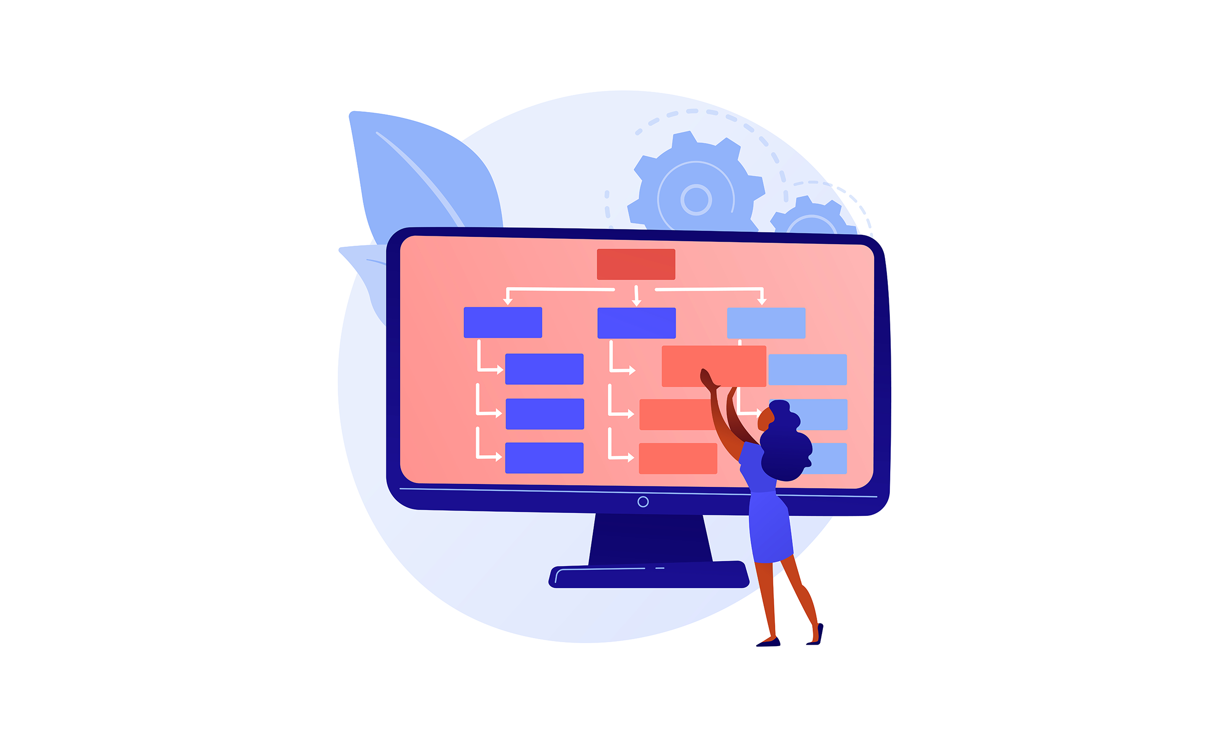
Understanding Visual Hierarchy: Guiding Users Seamlessly
At its core, visual hierarchy is the art of organizing elements in a manner that guides users seamlessly through a digital interface. By prioritizing content based on importance, designers can lead users’ attention to critical information, thereby enhancing comprehension and interaction. The arrangement of elements, including typography, colors, images, and spacing, all contribute to the overall visual hierarchy of a design.
The Principles of Visual Hierarchy: Creating an Intuitive User Experience
To outrank the competition, mastering the principles of visual hierarchy is paramount. One of the primary principles is the “F” pattern, where users tend to scan content in the shape of the letter “F.” Designers can strategically place vital elements along this scanning path to capture users’ attention effectively.
Another widely used principle is the “Z” pattern, which is prevalent when users consume content in a top-to-bottom and left-to-right manner. Understanding and employing these scanning patterns allow designers to create intuitive user interfaces that cater to users’ natural behaviors.
Color and Contrast: A Powerful Tool for Emphasis
Colors play a significant role in interaction design, influencing user emotions and perceptions. To create visual hierarchies that dominate search rankings, designers must wield colors effectively. High contrast between elements can draw immediate attention to critical sections, guiding users’ focus where it matters most.
By implementing a well-balanced color palette that aligns with the brand’s identity, designers can create memorable experiences that resonate with users and enhance the overall visual hierarchy of the website.
Typography: The Art of Legible Communication
Typography goes beyond choosing fonts; it is the art of legible communication in interaction design. A well-crafted typographic hierarchy can make content not only visually appealing but also easy to consume. By varying font sizes, weights, and styles, designers can emphasize key messages and create a seamless flow of information.
Using a combination of heading tags (H1, H2, H3, etc.) and appropriate font styles, designers can ensure that search engines understand the content structure and rank the page higher in relevant searches.
Size and Scale: Emphasizing Key Elements
In the pursuit of outranking competitors, size and scale become essential elements of visual hierarchy. By enlarging vital components, such as call-to-action buttons or section headings, designers can communicate their importance effectively.
Conversely, using smaller sizes for secondary or less important elements helps maintain a clear hierarchy and prevents clutter. This balanced approach guides users through the content in a logical and visually engaging manner.
Navigation and User-Focused Elements: Enhancing User Experience
User-centric design is crucial for outperforming competitors in search results. Intuitive navigation ensures that users can find what they need without frustration, leading to extended session times and lower bounce rates, which are critical ranking factors.
Designers can also employ user-focused elements, such as animations or micro-interactions, to create engaging touchpoints that keep visitors interested and lead them to further exploration of the website.
Images and Visual Cues: Telling a Story
Incorporating relevant and high-quality images is a powerful way to tell a story and evoke emotions. The strategic placement of images can support the content’s narrative and enhance the visual hierarchy, capturing users’ attention and encouraging them to explore further.
Intelligently using visual cues, such as arrows or icons, can also guide users’ eyes to essential information or actions, creating a smooth and enjoyable browsing experience.
Mobile-Friendly Visual Hierarchy: Catering to Mobile Users
In today’s mobile-centric world, having a mobile-friendly visual hierarchy is imperative. Responsive design ensures that the interface adapts seamlessly to various screen sizes, optimizing user experience across devices.
Google prioritizes mobile-friendly websites in its search results, making this aspect of visual hierarchy essential for outranking competitors in search rankings.
A/B Testing for Optimization: Fine-Tuning the Design
A/B testing is a valuable tool for fine-tuning the visual hierarchy of a website. By comparing different design variations, designers can gather valuable data on user preferences and behavior, ultimately leading to a better-performing and higher-ranking website.
Future Trends in Visual Hierarchy: Embracing Innovation
As technology evolves, so will visual hierarchy trends. Embracing innovative approaches, such as incorporating augmented reality (AR) or virtual reality (VR) elements, can set a website apart from competitors and boost its ranking potential.
Conclusion: Mastering Visual Hierarchy for SEO Success
In conclusion, the science of visual hierarchy in interaction design is a powerful tool for creating outstanding user experiences and achieving higher search rankings on Google. By understanding the principles, leveraging color and contrast, optimizing typography, and catering to mobile users, designers can craft interfaces that outrank competitors and capture users’ hearts.
So, if you’re seeking to elevate your website’s performance in search results and provide your audience with an unparalleled experience, mastering visual hierarchy is the key. Embrace this art, and watch your website rise in the ranks, ultimately reaching new heights of success.
FAQs
What is visual hierarchy in design? Visual hierarchy in design is the arrangement of elements to prioritize content based on its importance, guiding users through a logical flow.
Why is visual hierarchy essential for user experience? Visual hierarchy enhances user experience by making the interface more intuitive and easy to navigate, leading to better engagement and understanding.
How can I create effective visual hierarchy? To create effective visual hierarchy, use principles like the “F” and “Z” patterns, apply color and contrast strategically, and ensure consistent typography and alignment.
What role does color play in visual hierarchy? Color influences user perception and emotion, making it a powerful tool for highlighting essential elements and evoking specific feelings.
Why is mobile-friendly visual hierarchy important? Mobile-friendly visual hierarchy ensures that the design adapts seamlessly to smaller screens, providing a better user experience on mobile devices.
How can A/B testing help optimize visual hierarchy? A/B testing allows designers to compare different design variations and identify the most effective elements that resonate with users.
Are there any future trends in visual hierarchy? The future of visual hierarchy may include incorporating augmented reality (AR) or virtual reality (VR) elements to enhance user experiences further.